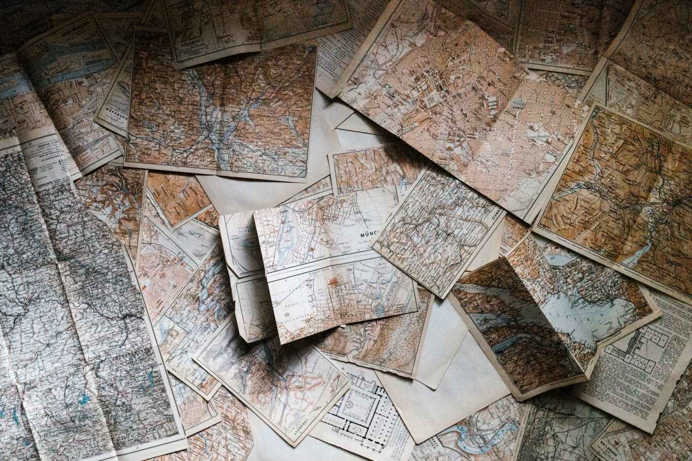
I make maps for a living at the dayjob.
Well, that’s not fair. That’s not the only thing I do. But it is one of the things I do. Specifically, I use existing mapping data, collect new mapping data, and then analyze stuff with that data by making different maps that do different things. For example, I have made maps that focus on trail networks, maps that focus on sidewalks and pedestrian infrastructure on-road, maps that include topography and maps that don’t. I’ve made watershed maps to look at our local infrastructure and see where things could stand to be improved to better stream health. I make maps for my own analytical purposes most often, but I also make maps that people are supposed to read and understand.
That last part is really hard. Not everyone knows how to read a map. And some folks know more about it than others. Designing a map for the public is different from designing one for public servants. Designing an interactive map is different from the design of a static map.
A friend of mine was complaining to me about the readability of fantasy maps recently, and I realized that a lot of folks probably don’t know what makes one map easily readable and what makes another map less so.
For me, there are three principles to really be concerned with in mapmaking. These are:
- Accuracy of information
- Clarity of design
- Aesthetic (e.g. color scheme)
The first of these is pretty self-explanatory. Informational accuracy is very important in any map. For example, in A Court of Thorns and Roses, the map used at the start of the book is not accurate to the text. The relative size and shape of the land masses depicted differs from what is described in the story. So making sure that you are correctly referencing the text or other sources of data you may have for a map is really integral.
This includes paying attention to rules of topography and geology in your map design. Knowing some basic things like how rivers flow (downhill) and how dams function (they create lakes upriver of the obstruction) is pretty important to making a good map. In fantasy mapmaking there are some exceptions to the basic topography rules that we experience in the real world. You could, theoretically, have a river that flows uphill for example. But it’s worth noting that should be justified in your worldbuilding and text.
Clarity of design is where things get a bit more tricky for mapmaking. What makes sense to one viewer is not necessarily going to make sense to another. That said, some easy principles include minimizing the amount of information presented and making sure that things are displayed to a consistent scale. For example, we can look at your standard map of MIddle Earth. Things included on this map are mostly important landmarks and mountain ranges. Topo lines? Not included — it would certainly jumble up the presentation.
Usually when designing a map for a story or project you want to include things that are actually relevant to the story. If your character visits a town and that town is integral to the plot, you should probably include it on the map. If you need more detail (e.g. if you need to depict specific street names for one town in particular) it’s beneficial to use an inset, rather than tie yourself to trying to fit that into the larger scale map.
Lastly, it’s important to note that aesthetic can do a lot for a map. Color choices, fonts, and weighting of labels can transform an otherwise jumbled map into something much more clear for the user. One of the most illuminating conversations I had during a map design meeting involved a client complaining that he couldn’t distinguish between two lines on the map. One was orange, one was green, and my client was colorblind. Most fantasy maps are not printed in color, so make sure that your map makes sense when printed in grayscale.
I hope this post was informative and helps you think about the work that goes into mapmaking of all kinds!
Want to support this blog? Buy books, kick me a tip on Paypal, or subscribe to my Patreon.

Leave a comment